

- Posts: 217
- Thank you received: 28


The shoutbox is unavailable to non-members
The Nexus Coloring Book
09 Jul 2014 09:57 #1238
by evilrobot
Replied by evilrobot on topic The Nexus Coloring Book
Brightness....bah....I'm going to keep calling it blackness....lol..
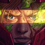
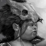
I just started trying this out a couple days ago so I wanted to try my own. This was just some random person I found on an image search that I used for a study.
So, here's my value sketch (the values were off a bit but not a whole lot so I was able to fix that at the end.

These are the colors I used in the multiply layer above my value sketch ( I did a few color comps before this just trying out different colors to see what worked) All colors at 100% brightness(Thanks Charlotte )
)

This is the color layer on top of the value layer and set to multiply

This is the adjusted final image I only made two adjustments. I used color balance to shift all the colors a bit towards purple and add a bit of harmony. Then I did auto levels command and that was it. This is what I ended up with.

I just started trying this out a couple days ago so I wanted to try my own. This was just some random person I found on an image search that I used for a study.
So, here's my value sketch (the values were off a bit but not a whole lot so I was able to fix that at the end.
These are the colors I used in the multiply layer above my value sketch ( I did a few color comps before this just trying out different colors to see what worked) All colors at 100% brightness(Thanks Charlotte
)This is the color layer on top of the value layer and set to multiply
This is the adjusted final image I only made two adjustments. I used color balance to shift all the colors a bit towards purple and add a bit of harmony. Then I did auto levels command and that was it. This is what I ended up with.
Please Log in or Create an account to join the conversation.

09 Jul 2014 10:42 #1240
by Charlotte
Any an all misspellings are henceforth blamed on the cats.
Replied by Charlotte on topic The Nexus Coloring Book
I'll have to try this... I don't think I ever paid attention to the brightness of the colour. (I've always just used trial and error and probably ended up using fairly bright colours anyway because something else would have had a different result, but there are a few things on a couple of pics that I think would have ended up differently if I'd paid more attention!)
Any an all misspellings are henceforth blamed on the cats.
Please Log in or Create an account to join the conversation.

09 Jul 2014 13:16 #1285
by Stuart
Replied by Stuart on topic The Nexus Coloring Book
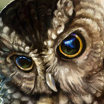
Phew, that facial anatomy is ......... int ......... well .............. creative. 
Lol. Nice job colouring though.
Lol. Nice job colouring though.
Please Log in or Create an account to join the conversation.
09 Jul 2014 15:49 - 09 Jul 2014 16:20 #1328
by evilrobot
Replied by evilrobot on topic The Nexus Coloring Book
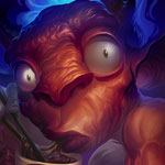
lol....hey....it was late....er...she got hit by a car....lol.....eh, it was quick sketch just wanted to try out the coloring.
Last edit: 09 Jul 2014 16:20 by evilrobot.
Please Log in or Create an account to join the conversation.
09 Jul 2014 17:05 #1332
by Stuart
Replied by Stuart on topic The Nexus Coloring Book
Had a quick crack a colouring this. Nothing sustain, skillful etc. Just numerous overlay layers and then a bit of tweaking here and there. Here's the link:
Link
Link
Please Log in or Create an account to join the conversation.
09 Jul 2014 17:08 #1335
by Charlotte
Any an all misspellings are henceforth blamed on the cats.
Replied by Charlotte on topic The Nexus Coloring Book
Perhaps it would be better to just attach it to your post so that everyone can see it here, in context?
(Also if you upload what is partially someone elses work to the Gallery you should probably mention the other person's name in the description, in this case kynamh.)
(Also if you upload what is partially someone elses work to the Gallery you should probably mention the other person's name in the description, in this case kynamh.)
Any an all misspellings are henceforth blamed on the cats.
Please Log in or Create an account to join the conversation.
09 Jul 2014 17:12 #1337
by Stuart
Replied by Stuart on topic The Nexus Coloring Book
Will try to edit it now, although the reason I uploaded it here was so it wasn't in 'My Gallery' (as it's just a rough thing based on kynamh's drawing I figured since he asked for it to be coloured then I'd just put a generic title). I can't find out how to direct link to the image from the cgart gallery, it just gives me a php script instruction in my address bar. Any ideas?
Please Log in or Create an account to join the conversation.

09 Jul 2014 18:33 #1356
by Valence
Replied by Valence on topic The Nexus Coloring Book
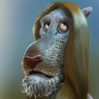
I used to do this kind of thing a lot before I got fed up of painting things twice (once in greyscale then again in colour) but there are stil ways to do it. The key is getting the values right. After you've applied colours it's very easy to get frustrated by the way that everything looks muddy but the drab darker midtones are not a result of the colour you're applying, it's because the initial values are wrong. So it's really important that the first sketch is not too contrasty and that it also has some smooth transitions. I used to suffer terribly with this until someone helpfully pointed it out (in fact that someone was markdraws, who has also migrated to this site. Yay!)
Anyhoo I've had a go at that previous post and combined everything into a single image to try and explain my way of doing it. Not necessarily the best way and not necessarily reccomended but all information is good, I suppose.
The first image (TopLeft) is the original greyscale but with the values adjusted to boost the midtones. I used Levels but Curves do the job just as well.
The TopRight image is the next layer set to Color mode and painted in with some generic , unimaginative skin tones... (and did I do blue hair?!)
The BottomLeft image is the next layer and is set to SoftLight mode. This just boosts the highlights where necessary and darkens and saturates some of the drab shadow areas.
The BottomRight is all those layers flattened. I then did an Auto Colour Balance (Control-Shift-B on my CS2) to get rid of the horrible colour cast that I always seem to leave on my skin tones, and I then darkened the background and put a bit of a rim-light effect to give a sense of depth to the surrounding space.
The following user(s) said Thank You: Charlotte
Please Log in or Create an account to join the conversation.
09 Jul 2014 18:49 #1361
by Charlotte
Any an all misspellings are henceforth blamed on the cats.
Replied by Charlotte on topic The Nexus Coloring Book
Stuart, there's a guide on how to include images in your posts, in the Welcome section. (At least I think that's where I put it.)
And it seems we're talking about either the same thing with different words or different things with the same words! You DID upload it to your gallery, by which I mean your CGAN Gallery. It's as much an image gallery as any other, so when I said to upload it here, I didn't mean here as in cgartnexus in general, but attach to your post about it here in this very thread. Same language now?
And it seems we're talking about either the same thing with different words or different things with the same words!
You DID upload it to your gallery, by which I mean your CGAN Gallery. It's as much an image gallery as any other, so when I said to upload it here, I didn't mean here as in cgartnexus in general, but attach to your post about it here in this very thread. Same language now? Any an all misspellings are henceforth blamed on the cats.
Please Log in or Create an account to join the conversation.
09 Jul 2014 19:14 #1371
by Stuart
Replied by Stuart on topic The Nexus Coloring Book
This is what happens if I try the link that the gallery gives me:

It's a .php (a web server script) instruction to retrieve the file, not a direct link to the image itself. I can't direct link to the image as I have no direct address to where the file is stored on the server - I only have a piece of text that tells the script how to retrieve the file. If I try to embed it in the post I will keep getting the link show up, as it's not an image. Don't know if we'll be speaking the same language on this one.
As for gallery talk, I didn't consider my gallery here as a gallery, as it only has one (quick, rough) image in it, hence I described my image as not being in 'my gallery'.")
It's a .php (a web server script) instruction to retrieve the file, not a direct link to the image itself. I can't direct link to the image as I have no direct address to where the file is stored on the server - I only have a piece of text that tells the script how to retrieve the file. If I try to embed it in the post I will keep getting the link show up, as it's not an image. Don't know if we'll be speaking the same language on this one.
As for gallery talk, I didn't consider my gallery here as a gallery, as it only has one (quick, rough) image in it, hence I described my image as not being in 'my gallery'.
Please Log in or Create an account to join the conversation.
Latest Activity

Banj updated their profile picture


Charlotte Still wearing a mask? Is it so we won't see you hoarding food in those cheeks of yours?
See More
Banj Mfmuh Guhmfpf
See More
Charlotte I'll take that as a yes...
See More
Charlotte Why is there a tiny flashing thing in front of the reply link/button? It's so small I can't see if it's an exclamation mark or a question mark... or...both?)
See More
Banj Because? Both!
See More
Charlotte *gasp*
See More

CaptainDeth updated their profile picture

CaptainDeth Ahoy folks, just a newbie here, just getting started. Thanks for allowing me in.
CaptainDeth Thank You
CaptainDeth and Mr.Bungle joined the site


honbasic joined the site


Gawk joined the site